Colours do more than decorate; they shape how we feel, change our energy, and affect how we act in a space. A sunny yellow kitchen can make you feel awake, while a calming blue bedroom can make you feel relaxed. This happens because of how colour works in Interior design.
Colour psychology examines how colours influence our thoughts, feelings, and actions. When designing interiors, this means selecting colours that complement the room’s purpose and mood. By understanding how specific colours affect people’s emotions, you can create spaces that promote work, relaxation, creativity, or socialising, depending on the room’s purpose.
Here’s what you need to know about the science and methods behind colour psychology. It covers how to select colours for different rooms, how light and culture influence what we see, and how to mix colours effectively. These tips can help you choose colours wisely and create the desired atmosphere, whether you’re decorating a cosy home or a work area.
The Science Behind Colour Psychology
Every colour causes a physical and mental reaction. Warm colours can speed up your heart rate and get you thinking, while cool colours tend to slow you down and make you calmer. These reactions come from our past, like seeing red and thinking of ripe fruit, or seeing blue and thinking of the sky, as well as our culture.
Designers use this information to influence people’s feelings and behaviour in a space. For example, a hospital might use light green walls to create a sense of safety and promote healing. A busy co-working space might use bits of orange and red to get people’s creative juices flowing and encourage them to talk.
Warm Colours and Where They Work Best
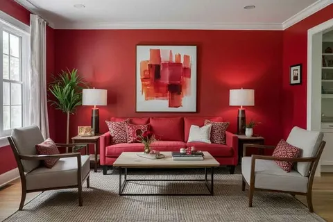
Warm colours, such as reds, oranges, and yellows, add energy and warmth to rooms. They create spaces that feel welcoming and are ideal for areas where people gather and converse.
1. Red
Makes you feel energetic and enthusiastic. Red gets your attention. In dining rooms, it encourages people to eat and converse, making meals more enjoyable. Shops use it on sale signs to make things seem urgent. Since too much red can make you feel stressed, it’s best used in small amounts in relaxing spaces. Try using it for cushions, art, or a single wall.
2. Orange
Makes you feel friendly and happy. Orange mixes the energy of red with the happiness of yellow, making it a pleasant colour. It’s great for casual living rooms, playrooms, and creative spaces. It can also add energy to a home gym without being too intense.
3. Yellow
Makes you feel bright and hopeful. Yellow feels warm and positive. It can create a kitchen and breakfast area that feels cheerful and inviting. Soft yellows work well in hallways to make a good first impression, while bright yellows can add a special touch to modern rooms. Designers often use yellow with grey or white to keep it from being too much.
Cool Colours and Their Ideal Spaces
Cool colours, such as blues, greens, and purples, help you feel calm, focused, and relaxed. They make spaces feel fresh and restful.
1. Blue
Makes you feel calm and reliable. Blue is a popular colour in design since it makes you feel calm. Light blue walls in a bedroom can lower stress, while dark blue in a library can improve focus. Blue is suitable for bathrooms because it feels clean, and for offices because it helps you concentrate.
2. Green
Makes you feel fresh and renewed. Green is both calming and energising. It evokes a sense of nature, making it suitable for almost any room. In living rooms, green brings a sense of peace. In offices, it helps alleviate eye strain caused by computer use. Adding plants makes it even better.
3. Purple
Makes you feel fancy and creative. Purple used to be for royalty, so it feels luxurious. Light purples, such as lavender, create relaxing spaces, while dark purples add drama to dining rooms or reading areas. Purple is also used in creative studios because it sparks ideas.
Neutral Colours for Timeless Appeal
Neutral colours are the base of most designs, giving balance and flexibility. They let other colours stand out and give your eyes a break.
1. White
Makes you feel clean and simple. White reflects light, making rooms feel bigger and brighter. It’s a common choice for simple, modern designs. In small places, white walls and wood create an open feel. Designers often incorporate textures or natural materials into white spaces to prevent them from feeling too plain.
2. Grey
Makes you feel stylish and balanced. Grey feels elegant and can be used in many ways. Warm grey works in bedrooms, while dark grey adds depth to kitchens or offices. Grey is also a good background for bright colours like teal or coral.
3. Beige and Taupe
Makes you feel warm and cosy. These colours feel stable and comfortable. They’re often used in living rooms and bedrooms to make spaces feel grounded. They can also create a peaceful, beachy feel when used with blues or greens.
Matching Colours to Room Functions
Choosing a colour scheme depends on what the room is used for.
1. Living Room
Since living rooms are for socialising, warm colours like beige or terracotta are good choices. Designers add colours through pillows, rugs, or art.
2. Bedroom
Bedrooms are for resting, so calm colours like light blue or green work best. Accent colours should be soft.
3. Kitchen
Bright colours, such as yellow or orange, are great for kitchens. These colours make you want to eat and create a welcoming space.
4. Bathroom
Cool colours, such as light blue or grey, create a spa-like feeling. They feel fresh and relaxing when used with white items.
5. Home Office
Green and blue are effective colours for productivity. Blue helps you focus, while green lowers stress. A wall in a colour like mustard can boost creativity.
How Does Lighting Change Colour Perception?
Colours can look different depending on the light. Natural light shows the actual colour, while light bulbs add warmth. Certain lights can make colours look cooler. It’s smart to test paint samples on walls at different times to see how the light changes them.
Colours can appear differently in different lighting conditions. Cool grey may appear modern in daylight, but it tends to look bluish under certain lighting conditions. Warm beige may appear orange in the evening with incandescent light bulbs.
Balance is vital in design. The 60-30-10 rule (60% primary colour, 30% secondary colour, and 10% accent colour) keeps things balanced. This keeps the room from being too much while still being interesting.
A living room might feature grey walls (60%), soft teal furniture (30%), and mustard-coloured cushions or artwork (10%). This adds depth without being overwhelming.
Colours can mean different things in different cultures. White signifies purity in the West, but it’s for mourning in some Asian countries. Red means love in the West, but in China, it represents luck. Research these differences when designing for people from other cultures to ensure the colours have a meaningful significance.
A beach house in Australia was designed with beige walls and green accents to replicate the beach outside, creating a seamless connection between the inside and outside.
A fancy restaurant in Paris used dark walls and gold to create a cosy, fancy dining experience that made people want to stay longer.
A Silicon Valley company designed its office with a focus on grey and white, but added orange spaces for team meetings and energy.
Conclusion
Using colour psychology in design means combining science, creativity, and personal preference. With the right colours, you can change the mood, enhance how a space functions, and create environments that support how people live and work.
Your dream space starts with the perfect colours. Let Studio Kimi help you change every room with aesthetic colour psychology.


