
What’s New
Six things crossed our desk this week, and two of them point the same direction. Colour is going deeper, and material is getting more specific. The rooms that hold up are the ones where somebody decided what the space is for before deciding what it is made of.
A Lawrence Park house rebuilt around its rituals
Sabrina Albanese Interiors renovated a 4,800 square foot house in Lawrence Park, and almost none of the interest is in the square footage. The plan was organised around what this family actually does in a day: a chef’s pantry, a coffee bar, a conservatory made out of what used to be outdoor space. The finishes followed. That is the brief we get most often in Oakville and Mississauga, phrased differently. Clients rarely ask for a coffee bar. They say they hate the morning bottleneck at the island. Read it on Design Milk
Four real stones, reissued as porcelain
VitrA Tiles released Geocode, a wall and floor range whose designs name their references instead of inventing them: Campaspero limestone, the marble of the Taj Mahal, Brazilian quartzite, Italian gneiss. The honesty matters to us. When a client asks what a porcelain is imitating, a real quarry name is a better answer than a marketing word, and it leaves somewhere to go if they later want the slab itself. Read it on Dezeen
Dark is fine. Cold is not.
An analysis of millions of peel and stick paint samples found warm colours now make up 69.4 per cent of what people test, up from 64.3 per cent three years ago. Browns have climbed from 9.2 to 13.4 per cent of shortlists, and deep warm tones are growing roughly six times faster than deep cool ones. Half of all shortlists now contain no cool colour at all. It confirms what we keep seeing at the sample stage: clients will go far darker than they say they will, as long as the undertone is warm. Read it on Design Milk
The ordinary house type, turned upside down
Schéido inverted a 2,600 square foot 1978 Vancouver Special, putting the living spaces upstairs under vaulted ceilings and the bedrooms below, then specified terracotta cabinetry, cork floors, quartzite counters and a cobalt faucet. Ontario’s side splits and back splits are the same problem in a different shape. The lesson carries: move the living space to the light before spending a dollar on finishes. Read it on Design Milk
The sauna stops being a solo act
Sid Lee Architecture completed a floating pavilion of about 1,858 square metres for the Bota Bota spa in Montreal’s Old Port, pairing exposed naval steel with panelled wood, cold plunges, and guided heat rituals on the hour. Residential wellness rooms in our market are still routinely drawn as a cedar box in a basement corner. This argues for the opposite: put the heat somewhere with a window, and give it enough bench to seat four. Read it on Azure
Thirty years of a home, refreshed rather than erased
Veronica Mishaan reworked a 580 square metre penthouse in Bogotá around an art and antiques collection the owners had built over three decades, adding colour, foliage tones, pattern and custom oak rather than clearing the decks. We take more of these than people assume: long tenured houses where the client wants the rooms to work like 2026 and still feel like theirs. Saying out loud which pieces stay is the first meeting, not the last. Read it on Dezeen
What We Picked
Two of this week’s items point the same way, so they are our pick together. The paint data says people are ready for depth as long as it stays warm. The VitrA release says a stone effect surface is stronger when it admits which stone it is copying. Put together, that is the argument we already make at the sample stage: choose the tone first, name the material second, and never let a finish be vague about what it is.
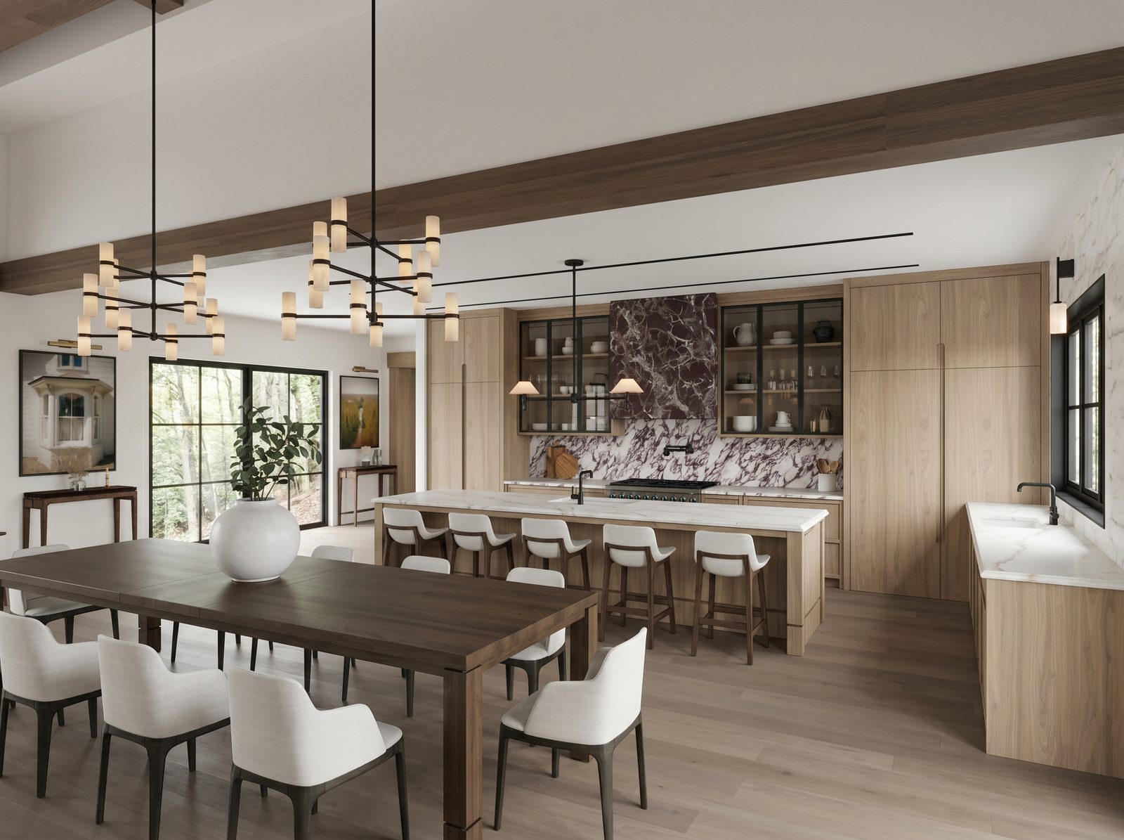
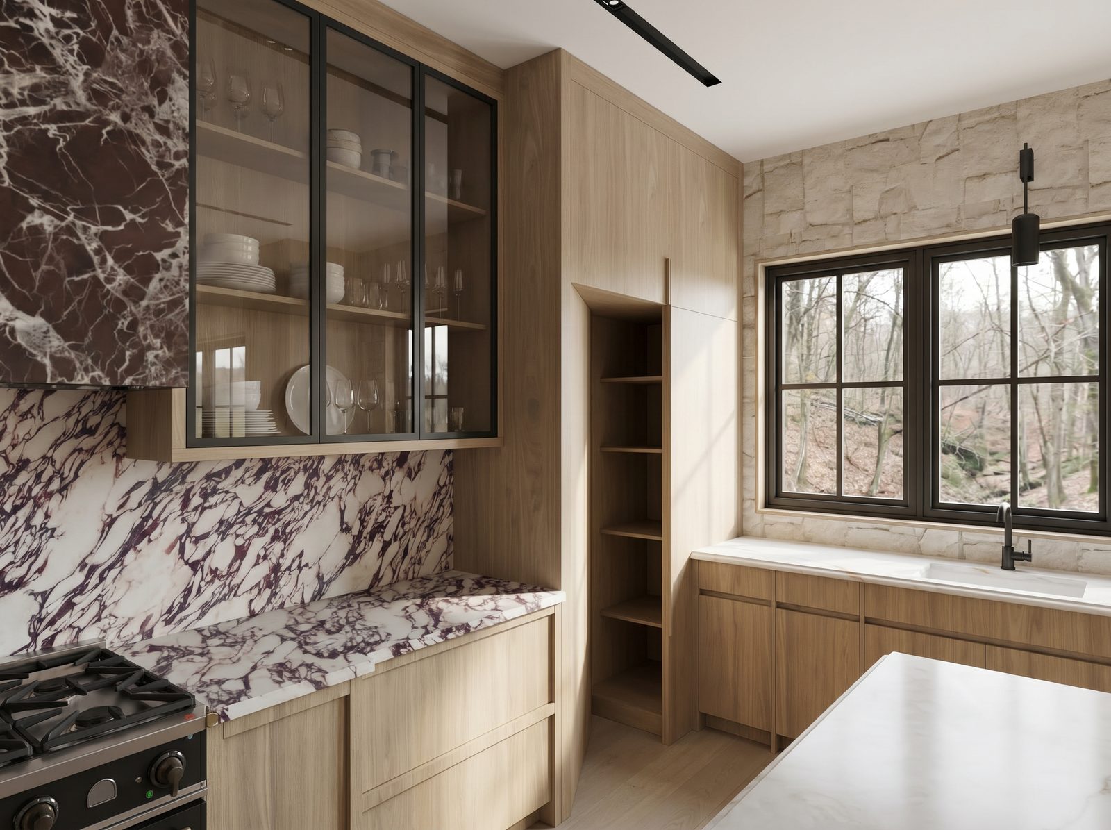
In our own work this reads as one dark, warm, clearly named stone doing the talking while everything around it stays quiet. The house below is the example we keep coming back to. The hood and the counters carry a deep oxblood veined marble; the cabinetry is warm white oak and the floor is warm too, so the stone reads as depth rather than as contrast. Nothing in the room is trying to compete with it.
The practical version, for anyone planning a renovation this autumn: settle the temperature of the house before you settle anything else. Pick your depth in a warm register, name the one material that will carry it, and let the rest of the room support that decision instead of adding to it. That order is easier to hold than it sounds, and it is the difference between a house that feels considered and one that feels shopped.
Planning a renovation in Oakville, Mississauga or the west GTA? We would be glad to walk through it with you. Start a conversation