
Design Process · Studio Kimi Journal
A forty-chip paint deck is not a colour consultation. Here is what actually happens when the wall colour is chosen against the cabinetry, the counter, and the room next door — not on its own.
By the time most homeowners get partway through a renovation, they’ve already made the big calls — layout, cabinetry, flooring, counters. Then someone hands them forty paint chips and asks them to pick a wall colour, and the whole thing stalls. It’s a smaller decision than the kitchen island, but it’s often the one people second-guess the most.
A color consultation is simply someone trained in how colour actually behaves in a room — not just what looks good on a chip — sitting down with you before the paint order goes in. It’s a real, bookable service on its own, and it’s also something that should be folded into a larger renovation rather than left until the very end.
What a color consultation actually covers
It’s rarely just “pick a wall colour.” A proper consultation looks at:
- Undertones — most “white” or “greige” paints carry a hidden pink, green, or blue cast that only shows up once it’s on a full wall, under your actual light.
- Your light, at different times of day — a colour that reads warm and soft at 10am can go grey and flat by 6pm, especially in north-facing rooms.
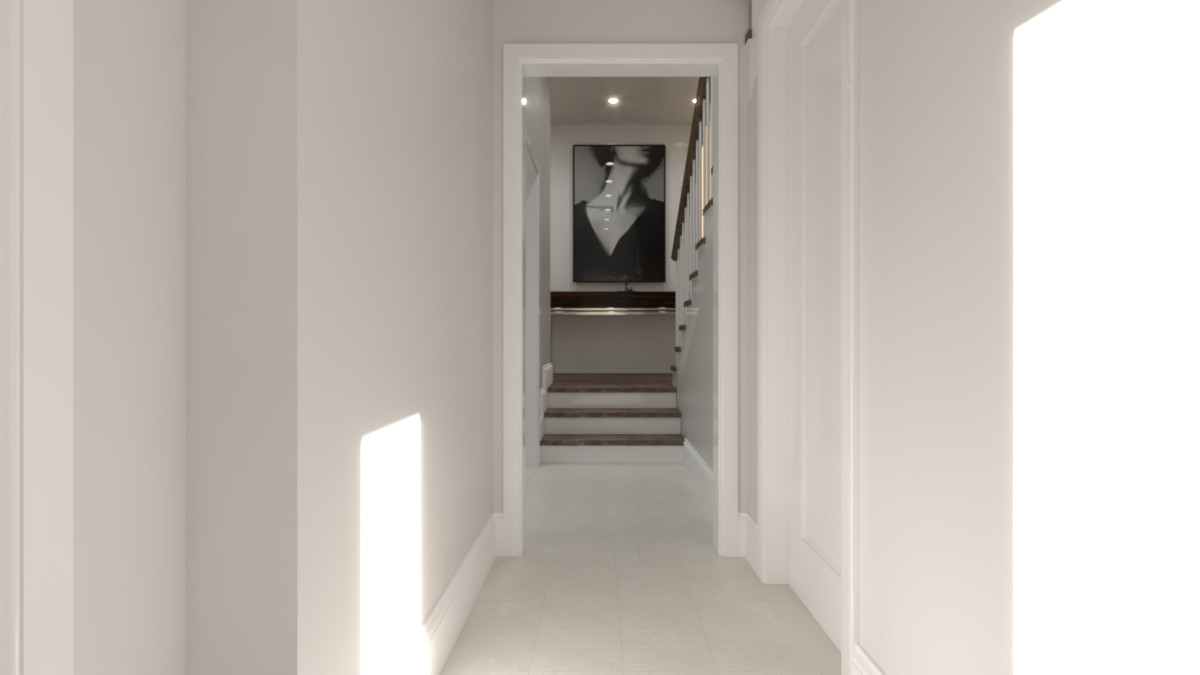
- How the rooms talk to each other — sightlines between an open kitchen, living room, and hallway need colours that transition instead of competing.
- Everything the paint has to sit next to — cabinetry, countertop, flooring, and any tile or millwork already chosen. A colour that’s perfect in isolation can clash the moment it’s beside your actual finishes.
What actually happens during the session
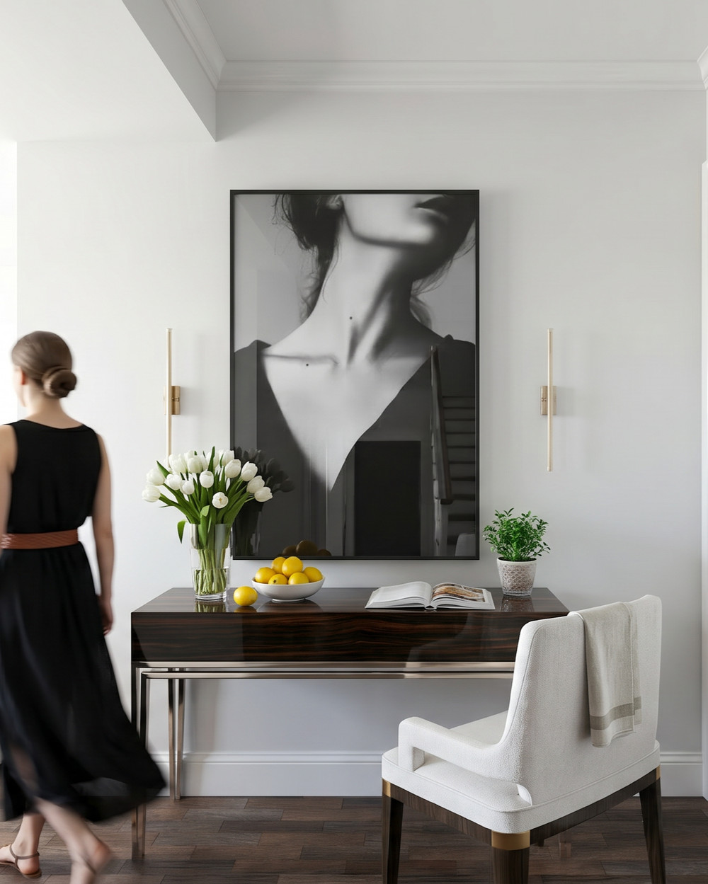
It’s less “flip through a fan deck” than most people expect. The useful version happens on-site, in the actual rooms, with the actual finishes in the room too — cabinet doors, counter samples, flooring, whatever’s already been chosen. A handful of large sample boards go up on the real walls, not just paint chips, so you can see how each option shifts across the day: morning light, midday, and evening with the lights on. Whatever’s carried over from a previous room (an adjoining hallway, a stair rail, existing trim) comes into the conversation too, so the new colour is chosen against what it will actually sit beside, not in isolation.
Why DIY colour choices go sideways
The most common mistake isn’t a bad colour — it’s judging a colour from a 2-inch chip or a sample pot on one wall. Paint reads differently at full scale, under real light, next to real materials. A chip that looks like a calm oatmeal can turn distinctly yellow once it wraps four walls in daylight. By the time that’s obvious, the room is already painted.
The second is chasing a photo instead of a swatch. A colour that looked perfect in a saved Pinterest photo was shot in someone else’s house, under someone else’s light, often edited before it was posted — it’s a starting point for a conversation, not a colour code to hand to the paint store.
The third is treating each room as its own decision. A house where every room was chosen in isolation rarely feels calm — it feels like a series of unrelated rooms. The spaces you actually move through together (kitchen to living room, hallway to bedrooms) need to be planned as one palette, not five separate ones.
Does this need its own appointment, or is it part of the design process?
If you’re only repainting a single room with no other renovation happening, a focused colour consultation on its own makes sense. But if you’re already mid-renovation — new cabinetry, new flooring, new millwork — colour isn’t a separate decision from the rest of the design. It has to be chosen against the materials you’ve already picked, which is why we fold it into the same design process as everything else rather than treating it as an add-on at the end. You can see how that’s sequenced on our design process page.
That’s also the real difference between a paint-store colour consultant and an interior designer weighing in on colour: the paint-store version looks at chips against a wall. A designer is already holding your cabinetry sample, your counter slab, and your flooring in the same room when the colour gets picked — see how that ties into residential interior design as a whole.
What if you’ve already painted and it’s not sitting right?
It happens even with careful planning — a colour that felt right on the sample board reads differently once the furniture, art, and daily light are all in the room together. The fix is rarely “start over”: more often it’s a targeted adjustment — a different sheen, a warmer or cooler shift within the same family, or changing one adjoining surface rather than repainting the whole space. Worth raising with whoever helped choose it before assuming the whole job needs redoing.
A quick example
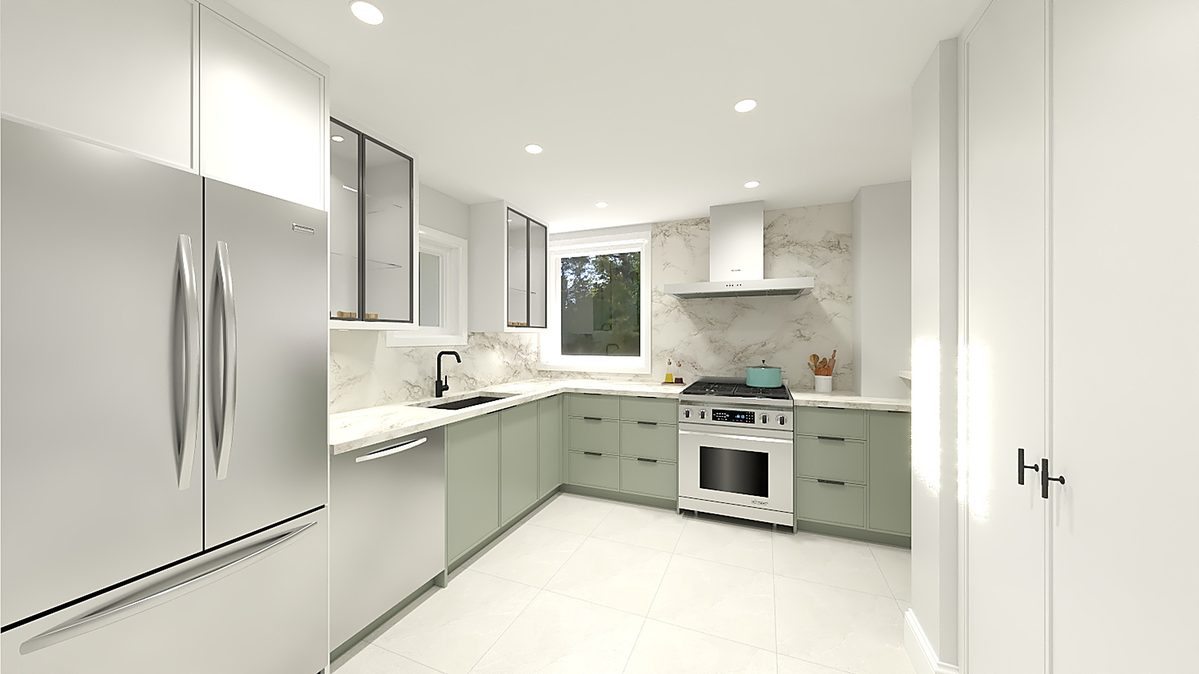
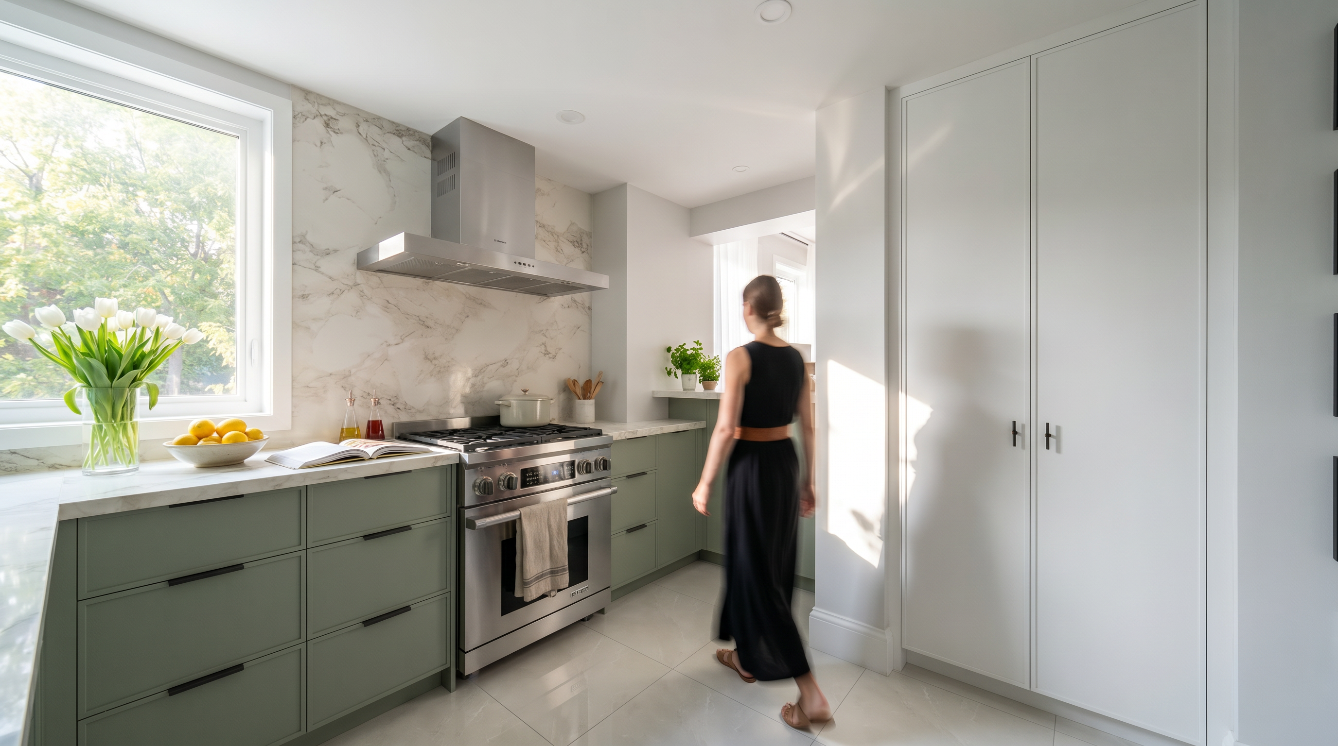
On the Lowther kitchen, the sage-green lower cabinetry was chosen alongside the counter veining and the marble-look backsplash at the same time — not picked afterward and hoped for. That’s the sequencing that keeps a finished room from feeling like it was decided one piece at a time.
Ready to talk it through?
If you’re staring at swatches and not sure which direction is right for your space, we’d be glad to help you work through it — as its own conversation, or as part of a full renovation. Reach out and we’ll go from there.