
What’s New
Six things crossed our desk between the 4th and the 7th of September, and the through-line is quieter than a trend: restraint that is doing real work. Not empty rooms — rooms held together by one colour decision and separated by texture instead. Alongside that, two porcelain launches and a genuinely strange new material out of Finland.
A penthouse finished entirely in sand tones
Antwerp studio Merckx-Holvoet Architecten has completed a two-floor holiday apartment in Duinbergen, on the Belgian North Sea coast, and taken the colour of the dunes outside as the colour of everything inside. The walls are sandblasted Travertino Noce, the floor is lime-based and runs continuously through the plan, and the built-in joinery is solid oak. There is no contrast cabinetry and no feature wall — the room is layered by the difference between rough stone, matte lime and satin timber rather than by any change of shade. Read it on Dezeen
Pink marble, without the marble
Iris Ceramica has released Breccia Rosa 4D through its Sapienstone line, a large-format porcelain slab that reproduces Breccia Pernice — the warm pink-and-oxblood Italian marble also sold as Breccia Oniciata. The part worth noticing is the edge: 4D technology carries the veining through the thickness of the slab, so a mitred corner on an island or a waterfall end reads as solid stone rather than as a printed surface wrapped around a core. Read it on Dezeen
A wall tile made of almost pure carbon
Finnish materials company Elementic has launched MO6, a wall surface made from lignin — the forestry by-product that is normally burned for energy because it is difficult to use for anything else. A patented bioreactor process strips out oxygen and other impurities until roughly 90 per cent of the material’s chemistry is carbon. The result is a thick, light, rough-textured tile in an off-black, described by Dezeen as the “world’s most carbon-storing building material”, and said to lock that carbon away for thousands of years. It is fire-resistant and durable, but for now it is sold for dry interior rooms only, with brick formats in development. Read it on Dezeen
A brutalist bank, answered rather than covered
Montreal’s Ivy Studio has converted a standalone 1970s bank near the Rivière des Prairies in Laval into a clinic for exotic animals. The building was built in a brutalist idiom and the studio chose to leave the raw concrete ceilings exposed, then answer them with warm grey textured plaster on the walls and walnut joinery, plus soft lighting throughout. Nothing is hidden and nothing is imitated; the concrete simply stops reading as unfinished once there is a hand-applied surface next to it. Read it on Dezeen
A renovation that removed a bedroom
Studio Rosenthal has gut-renovated an apartment on Gramercy Park in New York, and the first move was to undo a previous owner’s work: a subdivided plan was returned to its original two-bedroom layout so daylight could reach through the apartment again. The budget that would have gone into keeping the extra room went into quiet materials and custom millwork instead. It is a straightforward trade — one fewer room, a better apartment — and it is easier to show than to argue. Read it on Design Milk
Twenty-five Toronto showrooms, open in one day
Azure’s September calendar is unusually useful for anyone working in the GTA. Tycos Drive Trade Day opens twenty-five furniture, surfacing, kitchen and bathroom showrooms in the Tycos design district for a single day of product presentations. Park(ing) Day runs September 18 to 20 across Toronto and the surrounding region, turning parking spaces into small public installations, coordinated by Dubbeldam Architecture + Design. IDS Vancouver follows September 24 to 27 with installations on materials, landscape and workplace design. Read it on Azure
What We Picked
When a client asks for calm, the answer is one tone and three textures — not a neutral plus an accent.
The Duinbergen penthouse is the clearest example we have seen this year of something we keep arguing for at the drawing stage. A room does not become restful because it is beige. It becomes restful because there is only one colour decision in it, and everything else is a difference you feel rather than see: honed against sandblasted, matte plaster against satin timber, a woven textile against a hard floor.
The failure mode is well known and it is what most rooms actually do — pick a warm neutral, get nervous, then add a contrasting stone or a dark cabinet to make it interesting. That reads as hesitation. The alternative asks more of the specification, because when the palette collapses to one family, the finish of every surface has to be chosen deliberately instead of defaulting.
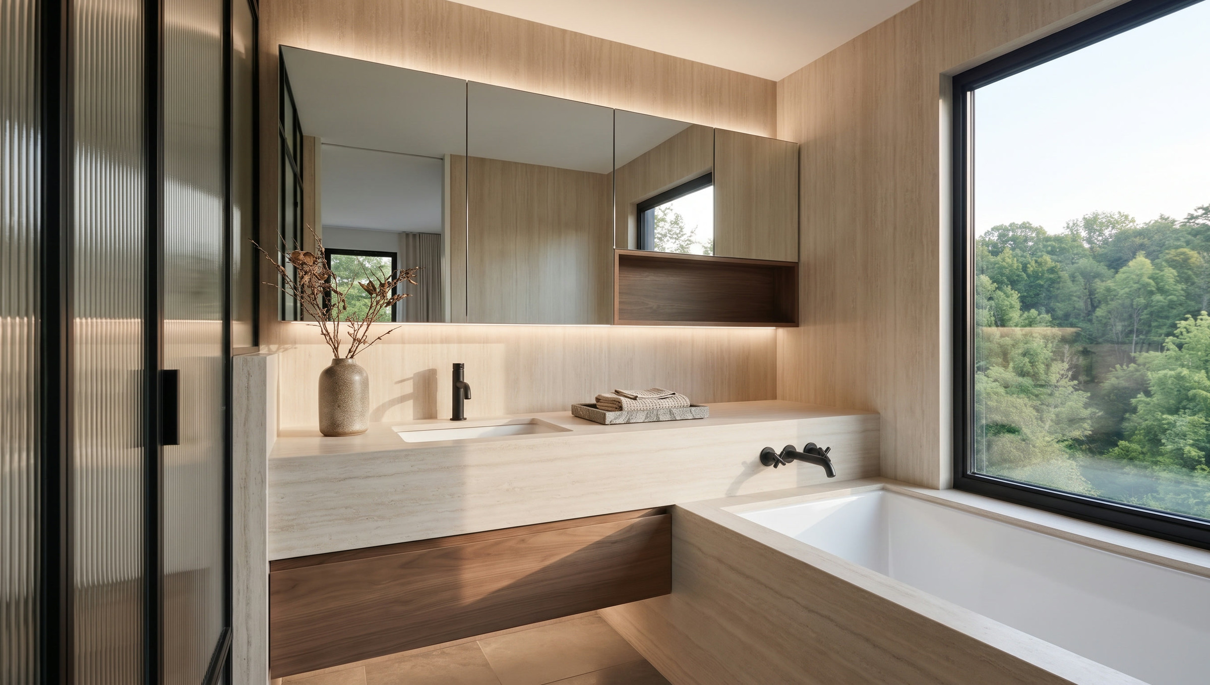
We built a room on exactly this logic at Sixth Lane. The principal ensuite at the top of this page is travertine on the walls and the counter, walnut on the vanity, white oak underfoot, and a black steel-and-reeded-glass screen doing the only hard edge in the room. Read the photograph as a colour scheme and it looks like one material. Stand in it and it is four, separated entirely by texture and sheen.
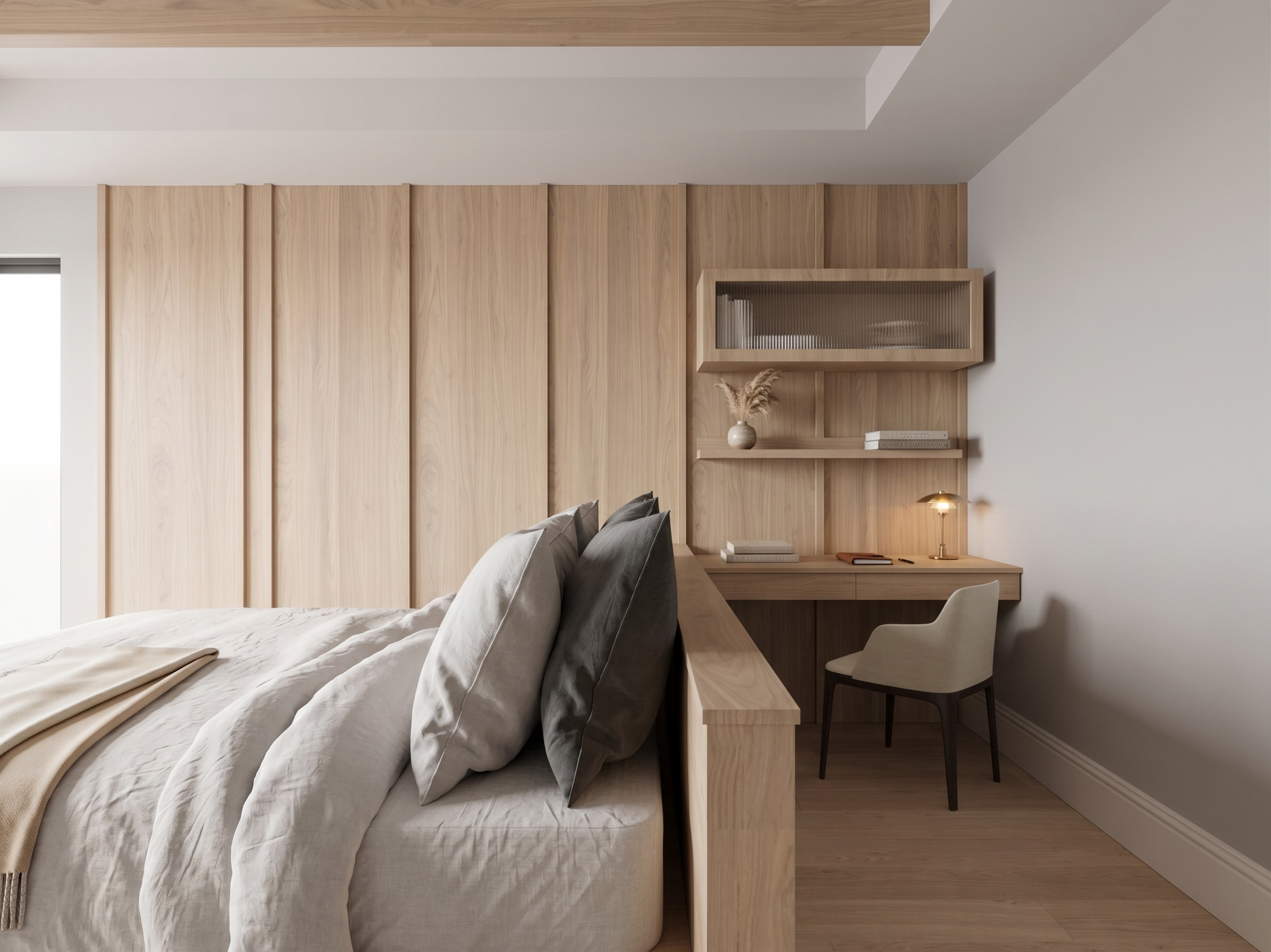
The second thing we are taking from this week is smaller and comes from Laval. Warm grey plaster with visible trowel texture is the cheapest way we know to make exposed concrete read as a decision rather than a defect — which matters here, because low concrete ceilings are the single most common thing clients ask us to hide in a west GTA basement. Very often the better answer is to leave it and change what is beside it.
None of this is a style. It is what happens when the finish schedule is worked through slowly enough that each surface has a reason. Design is a process: the first meeting, the sketches, the sourcing, the renderings, and the decisions made together along the way. The rooms that feel calm are usually the ones where that process had time to remove things.
Planning a renovation in Oakville, Mississauga or the west GTA? Let’s talk about your project.