
What’s New
Six things crossed our desk this week, and most of them are about the same quiet shift. Colour is coming back into rooms, but in deliberate places: a moss green on the walls, a red stone on the island, a yellow line of grout. The rooms that handle it well commit to one idea and let everything else stay calm.
Art Deco, distilled to its curves
Lang Architecture has joined two 1930s Art Deco apartments in New York’s East Village into a single home of about 1,650 square feet. Rather than reproduce period ornament, the studio kept only the geometry of the style: coved ceilings, rounded door jambs, limewashed walls, one strong marble in Calacatta Panozzo, and drawers faced in leather with brass edges. For older houses in the Annex or Old Oakville, it is a reminder that a curve in the right place respects a period better than added trim does. Read it on Design Milk
A Montreal triplex, reoriented rather than reinvented
Appareil Architecture renovated a triplex in Montreal’s Hochelaga-Maisonneuve without changing what makes it a triplex. The street face stays familiar. Inside, one continuous line along the party wall organises circulation, interior windows carry views through the plan, and a rear extension opens onto a deck and pool. Long, narrow and dark in the middle is the classic Toronto semi problem, and organising a plan along one wall is often a better answer than removing every partition. Read it on Design Milk
Red travertine, and a dining room that embraces the dark
In East Sussex, Irish studio Anam Design Studio wrapped a kitchen in red travertine that runs from the island along the counters and into a window bench, set against dark oak cabinetry. The existing range was re-enamelled in brown and bronze instead of being replaced. Next door, a round dining room with very little daylight was lined in curved oak and furnished like a private club. A room that will never be bright is better made deliberately enveloping, which is advice we give about lower levels all the time. Read it on Dezeen
Colour carried in the grout, not the tile
Margine Studio opened up a pre-war apartment in Rome over a white terrazzo floor, then placed colour precisely: a pink full-height cabinet wall in the kitchen, pink shelving profiles in the living room, and two bathrooms in tinted resin, one yellow and one green, both finished with yellow grout. Keeping the tile neutral and letting the grout carry the colour is a way to be bold with a small commitment. Read it on Azure
The 2027 paint colours leave greige behind
Behr has named Grounded its 2027 Color of the Year, a moss and olive green with brown undertones that the company says reads fresher in morning light and warmer and deeper by evening. Valspar chose Cottage Door, a mid-tone blue it positions as a colourful neutral. Two of the biggest paint brands landing on green and blue in the same season is a clear signal that the pale neutral years are ending. Behr on Design Milk · Valspar on Design Milk
Cersaie opens next week, and tile moves off the wall
The international ceramics fair runs September 21 to 25 in Bologna, and Azure’s preview describes ceramic becoming a building system, used on facades, pools, cabinetry and entire bathroom assemblies. Among the launches, Anatolia is adding Tuscano Burgundy to its Majesto porcelain line, a deep burgundy marble look with white veining in thin 6 mm slabs up to 160 by 320 cm, along with a concrete-look range called Architeq. Thin, large slabs on cabinet faces and full walls are the part to watch for residential kitchens. Read it on Azure
What We Picked
Choose a green in the light it will actually live in, not from a paint chip.
Behr’s own description of Grounded is the most useful thing we read this week. A green with brown in it is really two colours: the moss you see at nine in the morning and the deeper, browner shade you see at eight at night under lamps. Pick it from a small chip under shop lighting and there is a good chance you will meet a different colour on the wall.
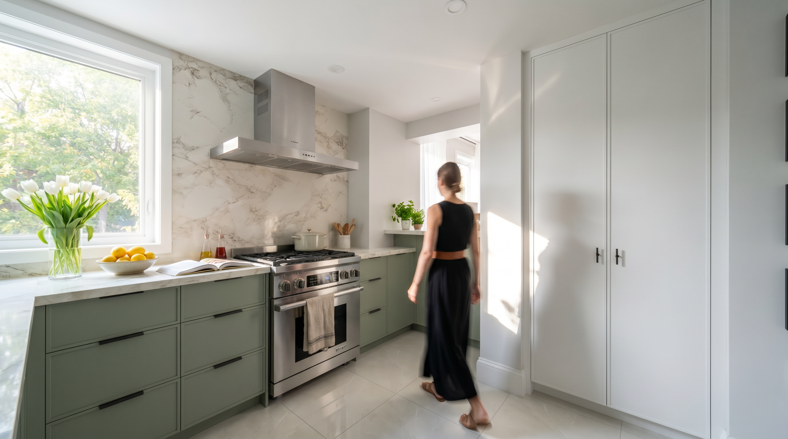
The Lowther kitchen at the top of this page, in Toronto’s Annex, is the paint half of that idea: sage-green lower cabinets under a full marble slab backsplash, with white full-height storage beside them so the green reads as a choice rather than a wash over the whole room. The window beside the range means that green changes a lot through the day, and it holds up because the marble and the pale floor give it something steady to sit against.
Our advice to anyone choosing a green or a blue this year: look at a large sample on the actual wall in daylight, then again at night under the lighting the room will really have, before anything is ordered.
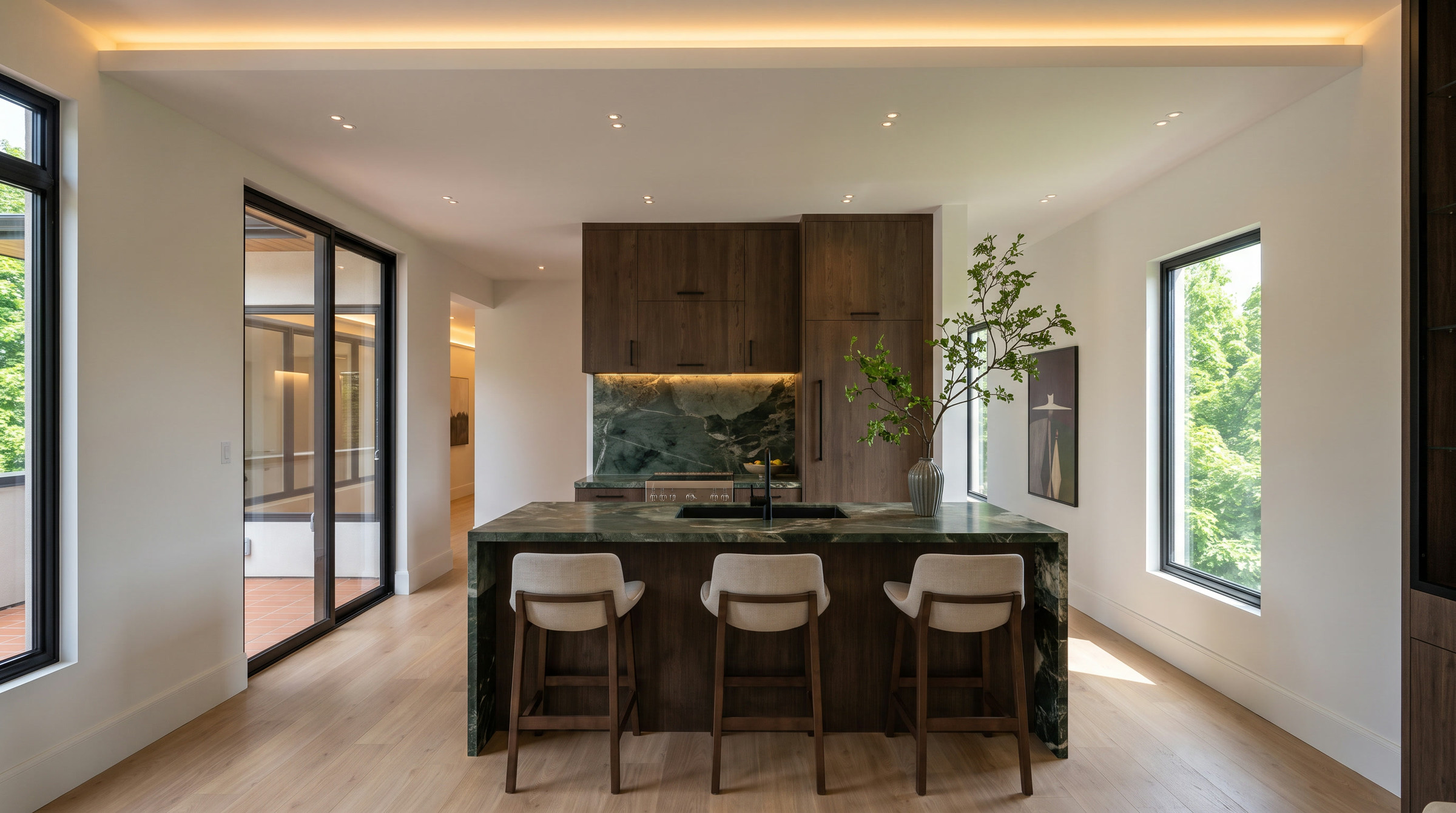
The Sixth Lane upper kitchen above is the other half. Its green stone and dark oak are Grounded in real materials, moss in the veining and brown in the timber, and like the paint it shifts from cool to warm as the light goes. Stone does not need testing the way paint does, but it does need seeing as a full slab rather than a sample tile, for exactly the same reason.
None of this is a trend to follow. It is a reason to take a little more time over the decisions that change with the light. Design is a process: the first meeting, the sketches, the sourcing, the renderings, and the decisions made together along the way.
Planning a renovation in Oakville, Mississauga or the west GTA? Let’s talk about your project.