Portside Pizza & Wings Co.
A neighbourhood pizza-and-wings shop, built from the brand up.
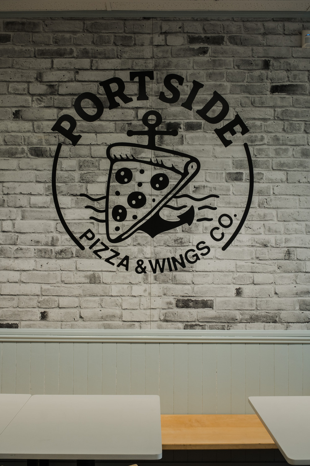
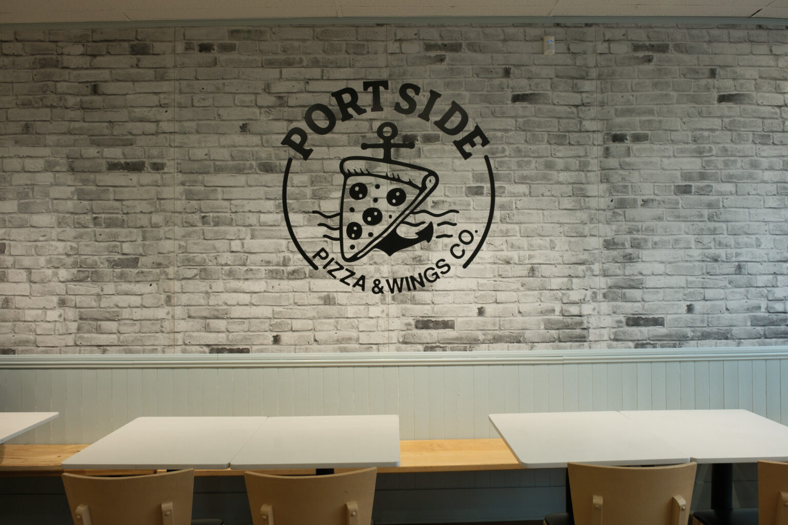
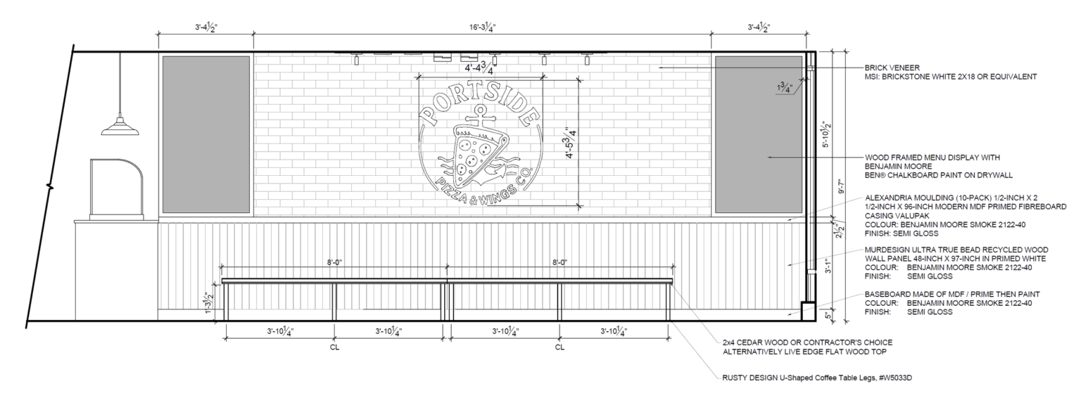
For Portside Pizza & Wings Co., the work started with the brand. Studio Kimi shaped the concept and brand identity — drawn straight from Port Credit — then designed the interior to bring it to life. Port Credit is water, movement, and energy, so the whole identity is anchored in maritime symbols: an anchor and waves, carried from the logo through to the finishes of the space.
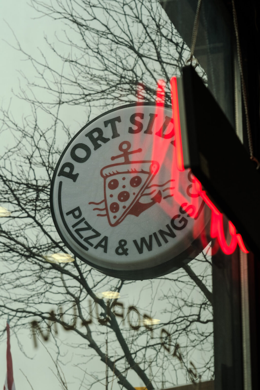
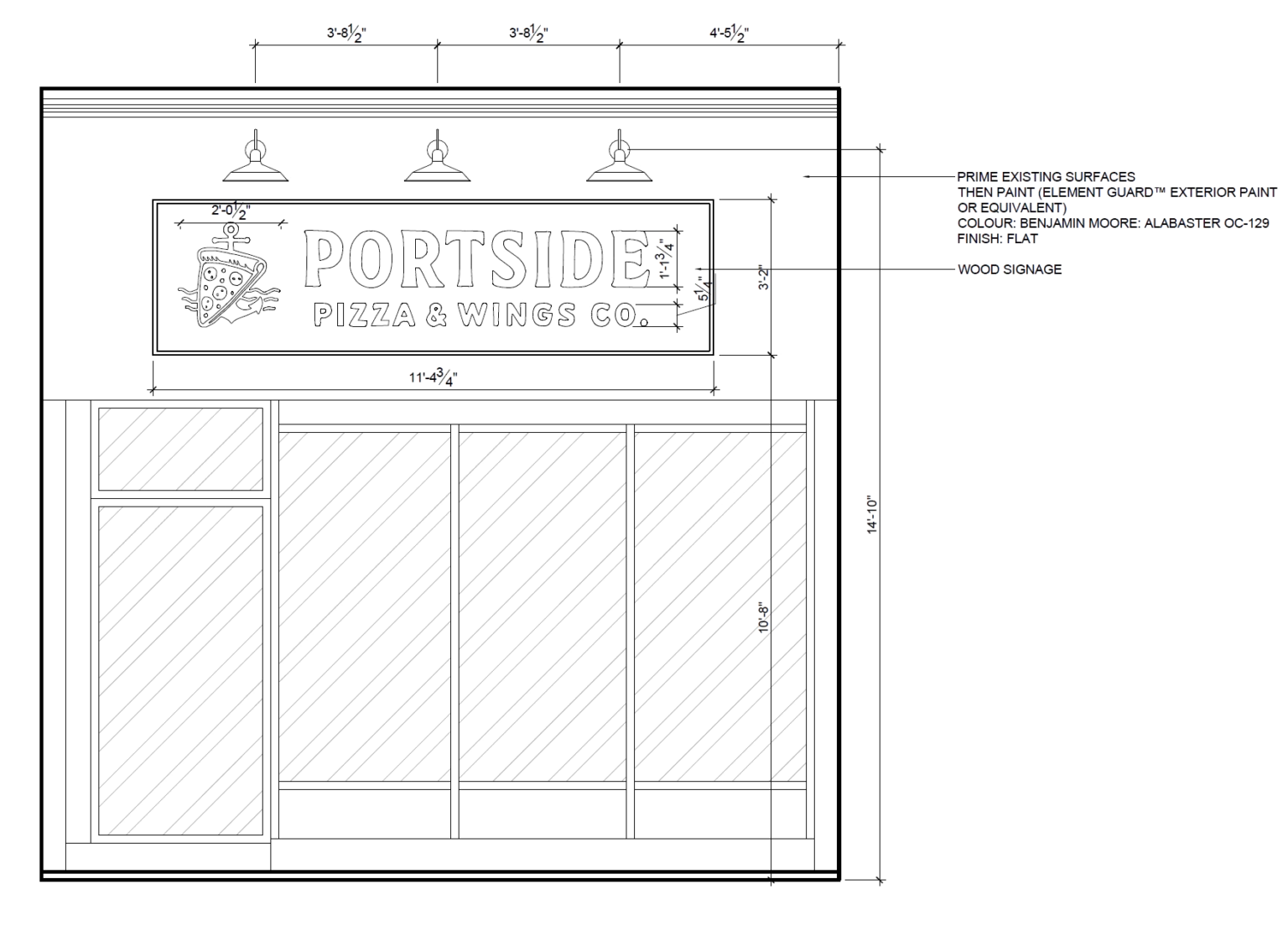
The storefront sets the tone. A warm white façade keeps things clean and inviting — and steps back from the bold red next door — while a contrasting wood sign and three wall-mounted lights make the branding glow after dark.
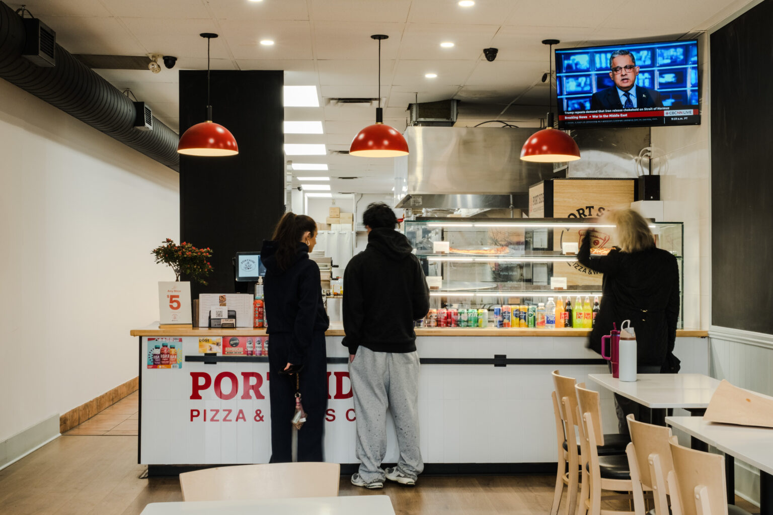
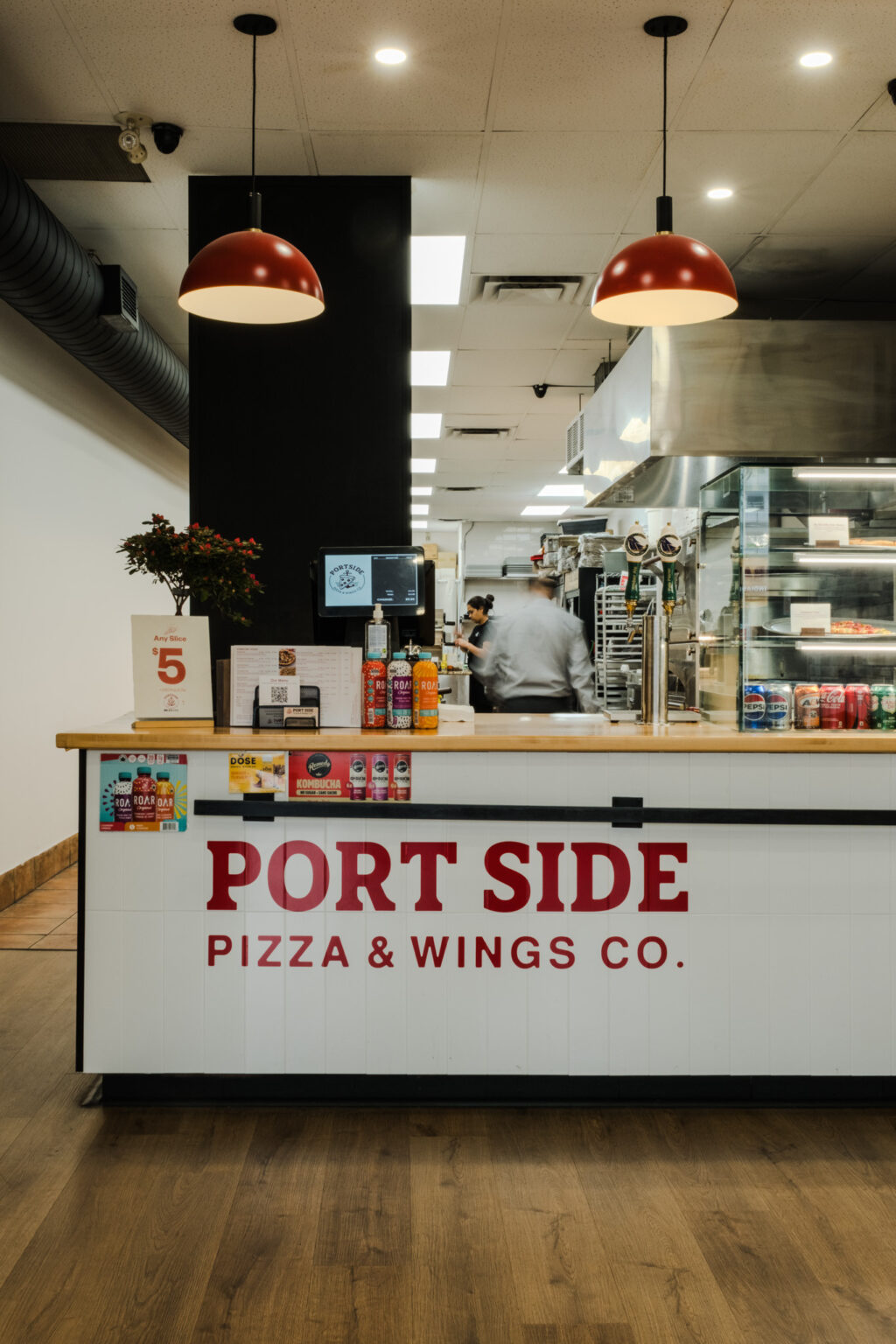
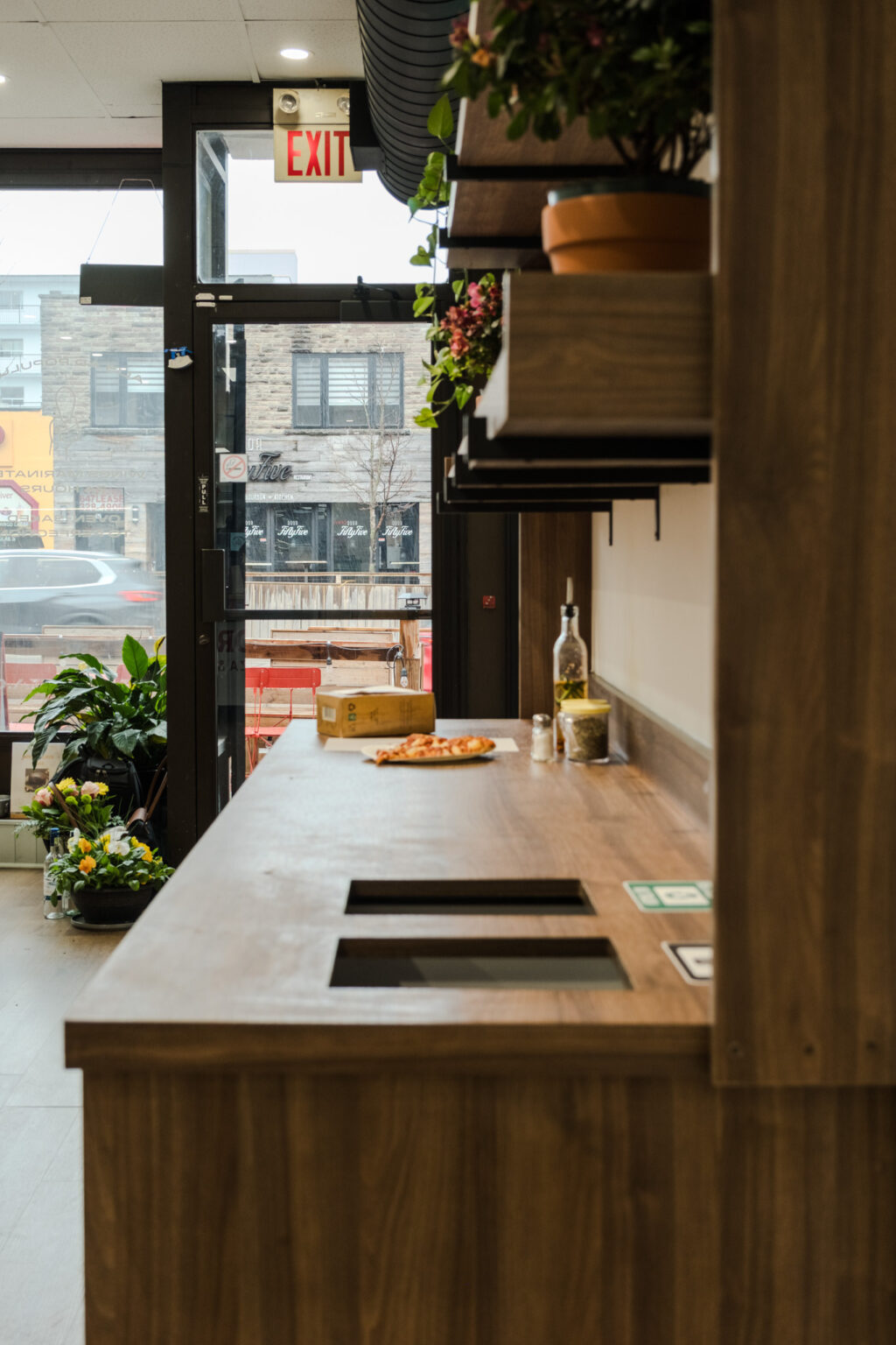
Inside, the story carries through. A light-blue shiplap panel brings a calm, coastal feel, and a white brick wall puts the logo front and centre. Chalkboard menus keep the space flexible, and a lighter, vertically stacked counter tile replaces the old red for a cleaner, more modern look.
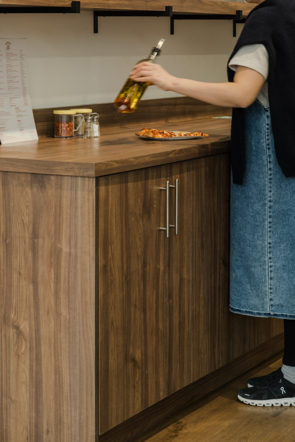
Even the practical pieces pull their weight: the front chalkboard doubles as structure for the kitchen pass-through shelving — hiding clutter while keeping a glimpse of the kitchen — and the self-serve station tucks the bins into a tidy display unit. From the fixtures to the finishes, every piece was chosen and placed to keep the space clean, functional, and unmistakably Port Credit.